Monday, March 27, 2006

Cubism: influences and terms

Excerpts from Cubism, by Neil Fox
The space of the Cubist work was unstable, even unrecognizable; textures were treated arbitrarily , and color reduced to a minimum. Writers on cubism have offered three main explanations: that the cubists were representing what the mind knows rather than what the eye sees; that were creating a pure realm of abstract form; and that they were making paintings about how paintings work. In general terms, it is true that Cubism rejects the commonplace notion that the work of art is a window on to another space, and insists that art can never deal with the world as it really “is,” but only with ways of seeing it and knowing it. (13)

The reality of photography was no more convincing to Braque and Picasso than the reality of academic art and the illusion of perspectival space. This effect of flattening, or returning the photographic space of the real world to the homogenous material of representational art. Picasso thus again returned the real space to the space of his own cubism. In an effort to “out-perform” the camera and the very notion of the real visible world. They blurred boundaries between seriousness and play, between truth and fantasy, and between the identities of things and the things themselves. (70)

Braque’s woman is in fact three views of the same woman, the three figures stand for facets of a single idea. (86)

The most striking aspect of Viaduct at L’Estaque is the layering of contours to suggest progression into distance, while leaving the precise spatial relationships between each plane unclear. (98)

Cezanne reflected at length on the task of painting, including his own fascination with accounting for the effects of slight shifts in his own viewing position. (100)

One art historian glossed it as the breaking of the contours of forms at some point so that "the planes spill or bleed into adjacent one’ Another, as “the running together of planes othwerwise separated in space.” The planes do not so much run together as “desist from their task of convergence to align with the picture plane.” (103)

Braque thought that Cubism freed painting from false illusionism. He believed it was an art of intensified relaism, which brought the world closer to the spectator, so close in fact that it was within reach. He said, “Scientific perspective is nothing but eye-fooling illusion, a trick, which makes it impossible for the artist to convey a full experience of the space, since it forces for objects in the picture to disappear away from the beholder. (110)

Picasso decided to transform his cast of characters into inanimate objects, and let their heads and torsos vanish into spaces and shadows. In convincing the reading of this transformation is that it marks a crucial shift in Picasso’s Art from narrative to iconic. (115)

The artist strives to create a maximum spatial contradiction, largely without giving up the difference between solid thing and the spaces between them. The compressed three dimension objects and space only make visual sense from one place. (118)

Having abandoned the illusion of solid three-dimensional objects in space, and substituted a play of pictoral elements such as line, shading, and texture, Picasso held his composition together with a loose or spontaneous grid-like structure. This brought the planes and lines into a kind of order, crucially unrelated to conventional compositional systems. Perspective, convincing visual illusion, and relative symbolic importance are replaced by the uneven rhythm of light, shade, and line tentatively aligned to the rectilinear edges of the canvas. The interest in mass and illusion of relief are abandoned in favor of a mysterious effect sometimes called “transparency.” (126)

If Renaissance perspective conveys the assurance that there is a correct place from which to see the world, Cubist paintings never finally declare whether there is anywhere to stand at all. The relief effects of Cubist paintings suggests a constant displacement position and ethereality meant not only that the world slips away from the image, but also that the viewer slip away from the world. (129)

Analytic Cubism come to refer to a process where three dimensional objects are broken don into fragments, corresponding to their appearance from different viewpoints in space which are then recombined in two-dimensions to produce a representation. Supposedly proceeds from observed reality to art. Although Analytic Cubism rejects single-point perspective, its combination of multiple viewpoints is thought to offer a fuller version of perceived reality. Synthetic Cubism reverses the process, reassembling the elemental shapes and fragments of Analytic Cubism in order to make new kinds of reality. (146)

What technologies of transportation meant, and what the jump-cut revealed, was that the centre of experience was time. As early as 1855, Heinrich Heine noted that “hrough the reailroads space had been abolished and the only thing left for us is time.” Everything in the world was gathered in the time of consciousness and visual experience now leapt from moment to moment and place to place, to be resolved and ordered only according to memory and consciousness.

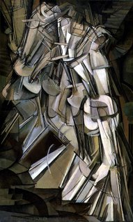
The major works were figurative the multi-figure compositions of Leger and Duchamp were distinguished from precedents to represent movement. Duchamp’s paint—literally a strip cartoon—shows the same woman walking though five stage of undress. The reinterpretation of cubist faceting as the fragments of continuous time was facilitated through chronophotography. This expert craft involved devising methods for capturing motion in still photography either as a blurred after image of the body moving through space in a single frame, or in a series of frames representing that movement in different stages. Duchamp became particularly fascinated by what he called “ a static representation of movement” in his work He called it “elementary parallelism” reducing the moving world to parallel linear elements.

Levels of reference, or of points of reference, and simultaneity—the conception of space-time. Space time refers to the new subjective experience of the world originating in Cubism’s transparency, simultaneity, and intersecting planes. There is hovering, vertical groupings of plans which satisfies our feeling of relational space, and there is extensive transparency that permits interior and exterior to be seen simultaneously. (396)

Supposed transparency of cubism and spatial openness of modernism in architecture. All stressed the subject’s experience of moving through such buildings as the equivalent of what Metzinger had first called “mobile perspective” (396)

Fourth dimension is time experienced or duration. The human consciousness experiences space and time as “duration” , as ever-changing and heterogeneous It is after all commonplace that time “flies by” or drags depending on circumstances, and that awareness of present can sometimes be lost when reflecting on memories. By contrast, the intellect or reasoning faculty wants to represent time and space by being homogenous. Space is supposed to extend like an endless sheet of graph paper, and the present to move along a straight line of time, which could be cut into hours, minutes, and seconds. Intellect has to do this in order to make use of the world, in order to mark out the distinct edges of objects and places, at distinct times. Bergson argued that this was a fundamentally false representation of things. (193)

Le Corbusier wrote a description of his building:
You enter: the architectural spectacle at once offers itself to the gaze; you follow an itinerary and the views develop with greater variety. Large windows open up views on the exterior where you find again the architectural unity. In the interior, the first attempts at polychromy allow the architectural camouflage, that is, the affirmation of certain volumes or the contrary, their effacement. (403)

Duration:
the continuous progress of the past which gnaws into the future and which swells as it advances, with a chain of vibrations. Oil painting could express depth, density, and duration, thought once inexpressible and encourages us to present within a limited space governed by a complex rhythm, a true fusion of objects.

Analytical Cubism:
Was based on the analytical dissection of objects in space, breaking them down into their component parts as seen from multiple viewpoints. These fragments would then be reassembled on the canvas to create a more complete and intellectually satisfying picture than that offered by conventional perspective.

Constructions:
Construction is based on the idea of collage but extends it assemblage of heterogeneous elements to three dimensional, challenging the idea of carved or modelled sculpture.

Futurism:
These artists developed a radical form of art capturing the speed and “dynamism” of modern urban life. They focused on the city in which all things move, al things run, all things are rapidly changing. They called this “universal dynamism” or the wold of dynamic sensation., with a flux of distinct times.

Futurist: universal dynamism
Delaunay: simultaneity
Salon Cubist: mobile perspective

Vanishing Point: case studies

As described by Gilles Deleuze, “The simulacrum implies huge dimensions, depths, and distances that the observer cannot master. It is precisely because he cannot master them that he experiences an impression of resemblance. The simulacrum includes the differential point of view, and the observer becomes part of the simulacrum itself, which is transformed and deformed by his point of view. The mastery of the viewing point is never removed from the nullity of the vanishing point. We often seem to be inside the field of representation, as in a dream or in a hallucination. In many of the pieces we have disappeared down a rabbit hole, only to emerge in a strange wonderland, where inside and outside, viewing and vanishing, have become one.”

Excerpted from an essay by Hal Foster
A key term for the work on display in Vanishing Point is simulacrum. The simulacrum is a copy without an obvious original, a representation without an obvious referent. The first attribute suggests that the simulacrum is bound up in repetition, but it is a distinctive type of repetition that issues less in a series of similar images or objects (as in the boxes of Donald Judd, say) than in a dissimilarity within each image or object that often distorts it.

The second attribute—the attenuating of the referent—suggests that the simulacrum tends towards abstraction. Most simulacra retain a resemblance to the world, however strained it might be. The difference is that the simulacra resemblance does not affirm the reality of the pictured world. Rather it tends to de realize it.

Sabine Hornig
Hornig’s photographs depict anonymous urban streetscapes reflected in the surfaces of empty, equally anonymous storefront windows of the sort typically found in the ground floors of these buildings. Unframed and installed at window height, some of Hornig’s photographs play trompe l’oeil games with our sense of surface and depth because at first glance they may be confused with “real” windows. The glass and screen become reflective veil and urban palimpsest on which traces of the city’s past, present, and future are inscribed only to be immediately replaced with something else. Some of which we see remains permanently situated, like buildings; other elements, like the passing traffic, are present only for a moment and then vanish.

Glass draws our eye through it, even as it reflects our own faces and bodies on its surface. Glass has the power to fragment and dissolve the images that play across it. By confusing spaces that are real, spaces that are reflected, and spaces that are photographed, Hornig asks us to consider the ways in which perception and expectation determine how they see. The translucent materiality of glass in Hornig’s photographs stages the dialectic of materialization and dematerialization through which we apprehend and experience the contemporary city.

Teresa Hubbard & Alexander Birchler
In their film installations and digital photographs, Hubard and Birchler create “looped” scenarios that deconstruct the language of the cinema and the illusory nature if filmic space. Their film projections present an ambiguous narrative situation that at some point imperceptibly doubles back on itself, creating “anti-plots” driven in circles by the force of sheer repetition, all shot from the same vantage point over the course of one day. Each photograph is composed of superimposed layers that appear as if they were a single, seamless image. By manipulating time and space in a manner not unlike that of a film strip, the photographs effectively turn the cinema and its devices inside out, mirroring the film’s ability to compress time and prolong our gaze all at once. In all of their works, time does not flow forward but gets stuck, like a piece of film that has jumped the take up reel. Leaving a frozen image on screen. There is no sense of the present, and no sense of presence either.

Luisa Lambri
She is interested in the ways that architectural space registers internally for its users. Her inscription of place is a subjective and recollective phenomenon, never fully realizable, registering only as a visual echo. Her use of photography as a means of dematerializing space., convey a synaesthetic sense of the body melting into, and being infused with space.

Won Ju Lim
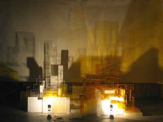
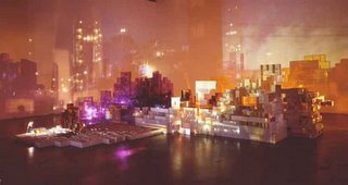
The translucent plexiglass is more like a refractory device that splits and sometimes shatters the projected images, so that they too take on the fractal qualities of the built structures they envelop.

Carla Klein
Carla Klein’s paintings return again and again to the subject of vacancy and emptiness, particularly the kind that characterizes place of transit such as airports, bridges, train or subway stations, and other places trough which people pass on their way to somewhere else. Figure and ground interpenetrate, interior and exterior become indistinguishable The difference between what is solid and what is shadow, what is physically present and what is a reflection, and between positive and negative space becomes equally indistinct.

Unsure of where we stand, we slowly come to understand that the space of the painting and the ambiguous nature of the space it represent are analogous. Through their emptiness, Klein’s spaces stage the disappearance of meaning, leading us to a state of uncertainty and loss of control over our perception of space, rather than an illusory sense of mastery over it.

Edward Ruscha
Ruscha’s Petroplots are clearly meant to function differently than a Thomas guide or travel book. Ghostly lines and street names drift over a terrain that, although totally specific, denies the viewer the information necessary for navigation. To someone who knows LA, however these atmospheric surfaces may trigger all sorts of memories, personal association, and cultural meanings. The Petroplots elevate foreground and background, highlighting the dynamic of specificity and abstraction that characterizes not only all mapmaking, but also Brian Eno’s notion of the ambient and Marc Augé’s concept of the nonplace.

Amelie Von Wulffen
Amelie von Wulffen’s collage paintings construct fantasy architecture based on places she has partly remembered and partly imagines. She combines photographic images with drawing of fragmentary interior spaces, often undoing distinctions between inside and outside. The motif of the fragment appears again and again in her work, both formally ad as an idea.

Corinne Wasmuht
Like a human scanner, Corinne collects images of places she has visited or imagined and files the information away. She later combines different space, places and times in mural-size paintings that look like portals into another dimension. She is particularly interested in the play of light and color emitted from stain glass windows, neon signs, television monitors and computer screens because the color seems to be alive without a physical body. The paintings suggest that the beating, blinking lucent lightscapes characteristic of the contemporary metropolis respond to a very real human desire to see flickers of: life” pulsing around us.

Amy Wheeler
Automobile Oriented cities like Los Angeles offer infinite possibilities for engaging the pleasure of the passive, fleeting glance. The inspiration for the paintings comes from driving around LA’s surface streets at night. The lens of looking from one disembodied space (the empty boutique) from another (the moving automobile) creates a sense of vertigo. Wheeler aims for a rapid flow of paint to surface that mirrors that fleeting traces of a nighttime cityscape in motion.

Carrie Yamaoka
In her book, Megalopolis, Celeste Olalquiaga describes the contemporary city as having a “hologram like aesthetic” where “buildings are seen to disappear behind reflections of the sky or merge into one another.” This endless series of reflection encourages a sense of limitless space, but any sense of physical freedom this may foster is “soon lost to the reproduction ad infinitum of space—a hall of mirrors in which passerby are dizzied into total oblivion. She creates this experience to “psychaesthenia” defined as a state in which the relation between self and surrounding territory is disturbed, where “the space defined by the coordinates of the organism’s own body is confused with represented space.”

Yamaoka’s mercurial works meld opposites; appearing both solid and liquid, reflective and refractive, they dissolve boundaries between painting and sculpture, along with those between the discrete art object and the room-sized installation.

Sunday, March 26, 2006

Hornig: perception and imagination


http://www.tanyabonakdargallery.com/artist.php?art_name=Sabine%20Hornig

Excerpt from Tanya Bonakdar Gallery press release

Entitled Out Front, the exhibition is comprised of new sculpture and photographic work, each provoking an enigmatic discourse between viewer and object. Referencing storefront windows and building facades respectively, the photographs and sculptures set up an ambiguous relationship between visual penetration and physical access—placing the viewer simultaneously within and outside of the work's frame. Subverting the Modern dynamic between form and function, Hornig's work releases form to explore the relationship between architecture, perception and imagination.

In the three sculptural works that comprise Out Front, Sabine Hornig presents artifacts of Modernism's transcendence into a functional, global language—a language of migration, identity and ambiguity. The structures that inspire the works are selected primarily for their formal composition, presented by Hornig as remnants of a utility that is now somewhat unclear: a glass storefront, a building entryway, and a bus stop. Relegating these forms to mere symbols of functionality (but without actual function), Hornig's work subverts the enslavement of design to serve efficiency, economics and pragmatism. Instead, Hornig explores the nature of these forms as symbolic architecture, or virtual structures. Flat forms are brought forward, from two dimensions to three, and present a series of unfolding 'fronts' with no 'back' and 'exteriors' without 'interiors.' Non-specific to locality, the structures are as likely culled from a government housing project as the most exclusive city block from Athens to Los Angeles to New York to Berlin. This anonymity is further emphasized by the rough, stuccoed surface of each piece. As if they were cut from the standard concrete building blocks of the generic international city, they further attest to the hegemony and failed Utopian goals of Modernism.

The photographic works are based on empty storefront window facades, presenting reflections of streetscapes and exploiting the storefront window frames as compositional devices. As such, Hornig further displaces form from function, reconfiguring both to create a new relationship between the two. The street reflections are contrasted by the emptiness of the interior space, enhancing the dynamic between interior and exterior. And like the building facades, these storefront windows also explore the membranes that divide space, inside and outside, public and private.

Manipulating the language of Minimalist architecture and Modernist forms, Hornig weaves photography, sculpture and installation into a sequence of environments that provoke a discourse on scale, perception, and memory. Playing with the universality of generic Modernism, Hornig displaces architectural structures and manipulates scale in order to present the representational as abstract.

Perhaps the most ambitious exploration of her multi-media vocabulary, ‘Schule/School’ serves to integrate of the rigorously formal with the poetic narrative. Glass and aluminum foyers and wooden pavilions, modified structures appropriated from a prototype for a German school, function as the main sculptural components of the show. The repetition of this institutional building over and again throughout Germany generates for students an experience that is uncannily universal, and specific, at the same time. The schoolhouse itself is a cultural institution both public and private, describing both a location, and a community. Further, the school brings a particularly interesting dynamic to the exploration of scale and memory. As a small child perceives the world, teachers are taller, rooms are larger, and desks are bigger. This perspective changes when the grown-up student returns, as memory distorts scale and nostalgia functions as a filter for perception.

The glass and aluminum cube in the main gallery represents the version of the structure in an objective state. Here, we can perceive the entire building from outside, as we see the pavilion roof from below, set within the clean white cube of the gallery with its cement floors, its white walls, its bright lights. Of course, this is actually a constructed purity; the clean white-box positioned as unbiased space, a human invention. As the visitor moves from the main space to the smaller, perspective is flipped. The visitor finds their self inside the glass and steel cube that was observed moments before. This larger version of the cube is placed within the reconfigured smaller gallery. Affixed with large format transparencies of a wooded area, it is set within an imaginary forest, emphasizing the 'natural state' as opposed to the white cube. Yet, in the gallery context, this natural state is the foreign environment—the dream, the hallucination. Another pavilion-like roof is visible only through the thick brush of vegetation, its outline illuminated via a series of lights on its underside.

Another large wall seen when exiting the gallery suggests an imaginary view into an empty classroom. Built into this wall, a set of glass windows is affixed with large-format transparencies featuring photographic images of an empty classroom. Presenting an image on the one hand, the windows also function as lenses through which the rest of the architectural space is viewed.

Thursday, March 16, 2006

Michael Snow: chance and choice


http://www.ponybox.co.uk/design/collection.asp?id=117
http://www.eai.org/eai/tape.jsp?itemID=8363

Excerpted from online galleries
Michael Snow is a cultural beacon to many with an interest in film, photography or conceptual art. He is perhaps best known for Wavelength, one of the most influential experimental films ever made. Snow’s primary concern is with perception, which is evident in the enormous variety of his production, including painting, photography, sculpture, installation and music.

Solar Breath is a 62” loop of fluttering curtains that reveal and conceal an idyllic landscape in rural Newfounland. The work, originally shot in 8mm, has now been transferred to DVD. The work is a result of artist’s observations of a window of his summer cabin in Canada. Over the years, according to him, “a mysterious wind performance takes place in one of the windows, about an hour before sunset." The artist seek to capture in the film the various movements and folds that the window’s curtain creates against the window’s screen, with the interaction of the wind. This work, according to the artist himself, belongs to a group of film and photographic works who take subjects that were not formed by the artist as “art," but rather were “taken-by-surprise” by the artist.

In a text about this work, the artist writes: “What I saw in these sun-and-wind events was their potential as art. I did not record these "events" to share this modest phenomenon from my daily life with others. No, the rich play of light, surfaces and durations said to me: this real, un-staged event contains the elements which are essential for a contemplative time-light-motion work of art, a "motion picture" with "plastic" values and reverberant associations which will reward many viewings.”

The artist adds: “While on one level, Solar Breath is merely a fixed-camera documentary recording, it is also the result of years of attention....Solar Breath (Northern Caryatids) is 62 minutes of the most beautiful, eloquent movements and pliages that the sun, wind, windows and curtain have yet composed. Chance and choice co-exist.”

With each piece, Snow invites us to contemplate and put into question his chosen medium, in an oscillation between what is represented and its process and material. Snow pushes us into acceptance of present moments of vision, but the single drum beat that coincides with each edit in this elegaic section announces each moment of life's irreversible disappearance.

Wednesday, March 15, 2006

Placelessness

Excerpted from Vanishing Point
Music used to fill a space by accommodating itself to a particular environment rather than simply blending into it. It as music that was centerless and nonlinear, blurring distinctions between foreground and background. The work puts the user’s subjective experience at the center, because it is meant to be perceived as part of the background that is already taking place.

Film music is really music with its centre missing. Without seeing the film, you have something that has a tremendous amount of space in it. That space is important as its the space that invites you as a listener into the music. Enables the sounds of the outside world to penetrate into the composition. The music was subtle enough to fade into the background of the listener’s environment, but at times it also had the power to subsume that environment by subtly coloring it with its own tonal palette. Immersion was really the point. We were making music to swim in, to float in, to get lost in.

Eno’s music asserted the importance of background and atmosphere in defining a sense of place, as in the case of an airport or other transit zones, a sense of placelessness. In a manner unlike his, the photographs I take use emptiness and an overpowering sense of atmosphere, at the core of the human experience. Forms of descriptive information are suppressed. The work tends toward the detached, even the austere. The places depicted are mundane, easy to overlook or forget, and yet anything but banal.

Tuesday, March 14, 2006

e-Xplo: the unscene


http://www.e-xplo.org/

Excerpted from e-Xplo website
The tour is not so much about the sights, as it is about the unscene. Continuing the physiographic narrative e-Xplo initiated with DENCITY, 65 MPH re-orients the “tourist” with a new vocabulary for the city structured through the highway’s imperative for speed and distance. This tour was in many ways a response to questions that posed themselves in the Dencity project. If Dencity was grounded in a sort of scoptophilic or voyeuristic looking at places often unseen (“the Gritty Backstage’), 65MPH was about the absolutely mundane.

Moreover, if Dencity was a mobile work, it was still tied closely to the specific location it was engaged with. 65MPH was instead, a purely mobile work, it could happen on any highway, in any city or town. If Dencity was directed toward destinations, 65MPH’s sole desitination was the metaphorical and literal place of going, the highway.

The effect, particularly as the aural city stage changes more rapidly than the visual city platform, is to impose a different rhythm on to the visual and physical rhythm of the city, leading to layering, interweaving and discontinuity.

Rhythms conjoin with other rhythms in films—visual, comedic, narrative, spatial—to create a complex rhythm world where each film has its own life, yet also feeds off others. This is not a sound score in the manner of a comprehensive film. Nor is it simply settings where events exist in their own right. Rather than simply reading the city by looking at it, e-Xplo suggests a sonorous engagement between people, movies, memory, and architecture. e-Xplo's bus tour becomes a place of reflections, utterances, noises, rhythms, journeys, exchanges, while it gives an understanding of alternative ways of moving through cities.

Interview with e-Xplo about Dencity
conducted with cultural critic Steven Morton (December, 2000)

Steven: How does this project seek to fulfill the notion of Public Art? Or does it at all?

Rene: It engages public space and it takes place on a public platform, the road. I think the term public art is itself a question. What do we hold to be Public Art? Who is the public in public art? I think these are very important questions. So I think first and foremost, this bus tour is more of a question mark in relation to the status of Public Art today. Its also a response to the growing privatization of public space, which is becoming more and more common in many cities. The tour for us, is an effective tool for engaging public space. It also presents a different strategy and response to the question of privacy vs. publicity.

Dencity also starts with some additional questions. How can artists still work with public space, without necessarily getting permits, approvals, and commissions? How can artists engage public space and create a public work without leaving an indelible mark (i.e., some permanent sculpture or installation or sign)? How can one foreground the question mark around an art practice that engages/represents/uses not only public space, but also the community that occupies that space? In this case, we believe the act of touring can create interesting responses to all of these questions.

Steven: The word dencity denotes not only spatial density—as in the density of urban planning —but also embeds a different notion of dwelling. I was wondering what different connotations the den within the city might imply? (Webster's dictionary not only notes the sense of an animalâs lair, but also a hideout, a center of secret activity and a squalid dwelling. How exactly do these alternative spatial meanings operate within the word Density/ Dencity and the project as you imagine it?

Heimo: We came up with the term by basically condensing some words, which we felt needed to have some play in our title. Intense, dense, city. We were really not thinking about den as such, but I think it raises new questions. I think the root operates underneath the word density. On the surface, but with additions, compliments of history and time.

Steven: Dwelling is an essential idea. The history of that as a neighborhood, the history of Williamsburg that has been forgotten or set aside.

Heimo: One place we chose for this project for example is an area named Blissville. It borders an enormous toxic waste site, which is undermined by a huge oil lake. The size of the spill rivals what was set free in the big Alaska (Valdez) oil spill. In these streetscapes there is always the sensation of being underneath or between spaces. This place is without explicit function, simultaneously disordered, decaying and alive. Movement through the space is a flow within or through or over over-invested images.

Rene: This is an aspect of density, this idea of over-invested images. The entry point is not exclusively about a physical density or topographical one, but also a density that relates to its history and the relation of that history to the development of spaces such as this. There is a density that operates on a material level, oil underground, highway above, homes in between and then there is a metaphorical or less material density. I mean Blissville for example, is named after Neziah Bliss. A shipbuilder who is one of the key figures responsible for the existence of Greenpoint. So the name itself is dense. It carries, a history that then calls to the physical, social, economic, historical development of this area. Here I am speaking of a density that emerges in the intersection between space and time remaining contingent and constantly shifting.

Erin: Maspeth does not seem, at a glance, to be a social space where one encounters spontaneous meetings between people on the street. In fact, several of the sites we travel through are trafficked by trucks moving over enormous loading docks, warehouses with open/closed gates. Yet, inside these more or less industrial work environments, one sees that there are houses where domestic scenes are unfolding. Families having dinner, swing sets for children, TV's are being watched. Next door, warehouses, with few or no windows, not really derelict or defunct, many conducting some type of labor or activity. Not dissimilar from certain parts of Williamsburg or Greenpoint, but in terms of population-density they are dramatically different. So we hope that by taking people through these areas, a link does emerge about a relation that exists between them.

Steven: Why this intervention, why in this way. Why not walk people through.

Heimo: It would be possible to walk as well, but you wouldn't get very far. (Laughter) No in all seriousness, driving with a bus adds many elements that you cannot have walking or say riding a bike or even taking a smaller car.

Erin: First of all we would not be able to make the links between these spaces in the span of an hour, that is essential. Second, we would lose this experience of voyeurism and surface which is also a big part of the experience. What I also like about our use of the bus for the tour is the way in which the physicality of the bus, its size, weight, etc. all of it is instrumental to the tour. So, we can ask the driver to drive over a curb heading for no where, just getting on and off the curb, and we will take you there, and youâll feel the road, the swaying of the bus, for a moment you are both simultaneously aware of the visuality of the road and also of its physicality. It's simple, but effective.

Rene: I think what you describe there is a moment where someone may actually be jolted out of their "standard" experience of a tour. When they board the bus, they may feel a sense of familiarity with the form. Most people have taken a bus tour. They can enter the confines of the bus and they can reference their previous experiences, maybe even a party bus with DJ's. And here they can establish another point of relation. We take the bus on a curb or drive it through a gas station to create some alienation or Verfremdung as Brecht would say. We invite the "tourist" to question this very act of touring.

Heimo: Can you elaborate?

Rene: Well, for example, the act of touring is quite a violent act. Besides the inherent voyeurism, there is a link to dismemberment. Dismembering a space, a body, cutting it up into digestible pieces, to create a sort of story or narrative. It is also a superficial act. In essence, the tour is about surface. The best tours are aware of this.

Erin: We are foregrounding some of the tensions that arise as one sits on a bus and visits these locales , namely, the desire for more standard information, the desire to exit the bus and visit these sites, the desire to see more, etc....

Steven: If we get something out of the collapse of things, what is this affective response, does it have any political content, and how can it be mobilized to think differently about the over determined spaces that we inhabit in our daily lives? Does the "collapse of things" signal nostalgia for an earlier phase of production and socio-spatial relationships? And by travelling to this impossible place, will it make any difference to the present conditions of the site itself?

Rene: We have to engage further with these contingencies and questions of relationships between history/present, center/periphery, and an infinite number of other binaries ripe for deconstruction.

Heimo: Itâs interesting to take on the part of a topographical agent. The city centers are a representation of wealth and at the same time make one feel secure. But they are also a visualization or manifestation of power. And the periphery represents exactly the contrary. In this formulation, center and periphery feed and depend on each other. It seems interesting to reverse things a bit and bring the center to the fringes and the other way around. That's kind of what's happening in this case.

Steven: Can you develop the relation between your personal art practice and Dencity.

Erin: For as long as I have been making work in New York, I have sought out these industrial locations to play in, in my own visual and sound development. Maybe it's the detail of such places, which I find so interesting. It's that there is a texture in the material itself, which does not necessarily lend itself readily to simple narration of events—as the layers are so dense. There is no centrality to the bus tour in terms of sound. It is a continuous streaming of fragments without working towards the construction of a dramatic or narrative resolution. There are concrete sounds that animate suggested events in such places as the waste management plant, Grand Street, schoolyards, and these sounds work against the syncing of sound to film image as I am playing with absence and presence of images/events and what you might expect to see but don't. Also abstract sounds, noises which envelope locations, hoods, but it is this continual blurring of physical boundaries w/and the laying down of new ones that the sound/image work gets very exciting. There is a tension that remains on the surface of the narration as we continue to move through the streets and never disembark the bus.

Heimo: My installations, these spaces I opened up always became theatrical spaces. Inhabited by artists and musicians. The space in my approach is an entity of activities and these activities produce sound as well as social realities. The Dencity project is working on a similar level. The difference is that the sights are already there and that the sounds are already there as well. We just had to map the route and collect the sounds.

Erin: The grandness of the city is very seductive, if one street light burns out the entire street is viewed differently than when we saw it with all the lights on. It's alive and we are moving within it, open to its occurrences and never able to assume it as a static piece.

Heimo: Itâs like an eruption of different themes that potentially could be seen, connections that you could make, but you donât have to, necessarily. Nothing is going on for very long. Episodes are disrupted every moment and superceded by the next. You find this fascination also in Richard Serra's films with the camera on the base of the bridge, the dimensions, change but there is almost nothing happening and it is rich with information. Or Yvonne Rainerâs dance pieces, there are no grand sensations or gestures, and still this work is so wonderful, full of energy and never standing still.

Rene: I work often with video, so going from directing a camera to a bus is quite a sensational experience. And there is a deep collaboration that develops not only with Heimo and Erin— matching and playing with the movement/pace of the bus in relation to the sound in real time—but also a collaboration between the driver and myself· not dissimilar from a relation between a cinematographer and a director.

I am also intrigued by the possibility of creating tensions between what may initially feel familiar/normal to something more critical/destabilizing. So the tour may be a familiar form, but what we do with it diverges from the "touring genre" (can we call it a genre?).
We try not to fall into idealizing or romanticizing or aestheticizing or fetishizing these sites. This is a difficult task, because I think the tour opens up to material as well as metaphorical possibilities...relations...questions.

Heimo: A bus, A sound system. A city. Simple.

Erin: But it is also terribly complicated. There is no place to put a speaker in a bus. (laughter)

Friday, March 10, 2006

American Apparel: behind the wheel


http://www.americanapparel.net/gallery/amateur/index.html

According to Claudine Ise, editor of Vanishing Point, “One of the most common ways of perceiving the urban environment today is through the window of the moving automobile. The fleeting, sweeping glances employed by drivers and passengers turns the built environment into something dreamlike and abstracted, a steady stream of lights and shadows across a series of reflective surfaces. “Non-places” like these make up an increasingly large percentage of our built environment. The city is a type of a dream space that exists in the subject’s mind as much as it does in material reality.”

Austin Calhoon is a 23-year-old from Bradenton, Florida. After first hearing about American Apparel's Amateur Photography competition, he sent in these snapshots, mostly taken from behind the wheel of his car all over LA. We loved them so much, we commissioned him to do a custom project documenting various streets in LA (Western Ave. in Koreatown, which can be seen on our homepage slideshow, and Sunset Blvd. from the Pacific Ocean to downtown LA, a work in progress). Whether or not behind the lens, Austin spends his time getting lost, enjoying the freedom that comes with not having a hairstyle, and going on garage sale adventures where he often finds the cameras that he uses for his work. This series was taken with some of the gems that he has discovered while shopping in various front yards and driveways.

Monday, March 06, 2006

Brian Eno: ambiant music

I became aware of setting each piece within its own particular landscape, and allowing the mood of the landscape to determine the kinds of activities that occur. In using the term landscape, I am thinking of places, times, climates, and the moods they evoke. The music I created was subtle enough to fade into the background of the listener’s environment, but at times it also had the power to subsume that environment by subtly coloring it with its own tonal palette. Immersion was really the point. We were making music to swim in, to float in, to get lost in. BRIAN ENO

Excerpted from an Amazon Review
Eno described in his original concept a piece to underscore life, without calling attention to itself. Imagine sitting on a beachside deck some warm evening with a microphone capturing all the noise of the environment: waves washing up, crickets chirping, gulls singing, the neighbors maybe becoming audible when their talking gets loud enough. Maybe some kid is driving down the next block with his stereo rattling the pavement. Maybe somebody's dog is barking far enough away that if you weren't listening closely you wouldn't even notice it. On Land is an exploration of this kind of idea in sound, but intended to re-create places far away or only imagined.

Released in 1982, On Land is Eno's most mature, perfect ambient work. Combining low, rumbling synths with eerie banging and clanking and the occasional wild-animal chirp or grumble, this recording places the listener alone, in the midst of a massive piece of sonic landscaping. And Eno has left no detail to chance. In fact, the work is so complete that when Eno suggests a windswept plain, the listener gets a chill. When trumpeter Jon Hassell bays with a softly disturbing imitation of a wounded beast, the first instinct is to scan the horizon for its glinting eyes. So subtle, intuitive, and well paced is this recording that as it slips quietly from the speakers and into every corner of the listening room, it transforms the space into a gently pulsing sound environment that seems strangely out of time and away from everything. It's a place you'll be drawn to time and time again.

Basically it's an album exploring the idea of music or sound that gives a feeling of a certain place. It also perfectly accomplishes his objective with ambient music, which is that it should be "as ignorable as it is interesting." Turn it up and it can bring all kinds of alien landscapes to life in your mind; turn it down and it colors the room subliminally, barely noticeably. Where the previous three in the Ambient series were subdued and trancelike through repetition, this one is evolving all the time and never repeats itself.

And with that, On Land is probably the hardest of all Eno discs to describe. It would be one thing if it was simply made with treated notes or tape loops, as with Discreet Music or the previous Ambient albums. It would be one thing if he was using minimal melodies meant to be ignored. On Land is all and none of those. It uses musical elements but isn't music; it's minimalist but not simple or repetitive. It's pure atmosphere. Forms don't exist. If you're wondering what moods you may find here, just look at the titles. "Tal Coat" is somehow electronic-sounding but purely organic. "Shadow" is a vague lurking moment of doubt. "A Clearing" is a four-minute synth haze radiating pure tranquility. It's not all soothing, but if it's left at a low audible level the dark moments won't really be disturbing.

Comparing this disc to any other ambient music is always an apples/oranges prospect, but I think the difference makes this the most pure and timeless Eno album out there. At the very least it sounds like nothing else I've ever heard, except maybe the sounds of nature itself. The complexity of the music is presented in a beautiful, relaxing setting that isn't demanding. which is what makes it absolutely brilliant ambient music.

Brian Eno's Music For Airports is a further realization of his ambient concept, first realized on Discreet Music. The concept again is similar, simple lines of varying lengths are played in loops, allowing them to interact in various ways. The results are often times remarkable. For music intended to be background material, this work can grab your attention.

The opening movement, and probably the best on the release, is a good example of Eno's idiom-- two or three extended loops of simple piano and electric piano intertwine. The results are absolutely stunning as the music has a delicate and gentle quality to it. While the rest of the record isn't nearly as good as this piece (one piece is a vocal-only loop piece, one is vocal-and-piano, and the closer is pure synthesizer), it is all quite good.

Thursday, March 02, 2006

Won Ju Lim: illuminated projections


http://artnet.com/artwork/424172585/won-ju-lim-memory-palace-baroque--2.html
http://www.pilarparra.com/artistas/won_ju/2.htm
http://www.artnews.info/artist.php?i=575

An MFA graduate of Art Center College of Design in Pasadena, Won Ju Lim currently lives and works in Los Angeles as a sculptor and installation artist. Taschen’s Art Now: 137 Artists at the Rise of the New Millennium finds that Lim’s work “focuses on the tensions between perception, space, and subjectivity in the post-modern age. In order to reflect on and represent the shifting relationship between these three elements, she usually takes architectural reconstructions whose ‘realism’ she questions, critically and poetically, through the judicious use of light, slide projection and video installation.”

She is best known for her installations of illuminated clusters of Plexiglas and foamcore, recalling architectural and industrial landscapes. Won Ju's work investigates fantasy, materiality, modeling, and illusion. These new pieces make good on what Lim's past installations have striven for: wonderful and uncomfortable overlays and slippages of present and past, presence and absence, and the strange commingling of memory, fantasy, physicality, modeling, and illusion. They harness illumination, distortion, projection, and shadow as method and metaphor, leaving their viewers standing in the light and in the dark.

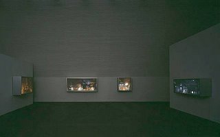
Won Ju Lim is known for groupings of foamcore and Plexiglas architectural forms illuminated by still and moving projections of urban and industrial landscapes from within and dramatically lit from without. The structures double as screens or refraction lenses, creating shadows and distorting the projections as they hit the walls of the gallery. Lim's second show at this gallery offered a departure in a group of mostly rectangular light/shadow boxes (all works 2003) twenty inches deep and ranging in size from roughly three feet square to nearly four by eight feet. Hung at picture height in a darkened room, the boxes negate their own clunkiness and turn into hazy, glowing paintings that evoke hilly, home-dotted views of Los Angeles's Highland Park.

Those familiar with Lim's work might see this new project as a strategic streamlining of her more unwieldy earlier installations into manageable, consumable objects. There's no doubt the elements making up Terrace 49 have a decorative appeal; they even elicit a momentary flashback to novelty lamps and look-it-glows items for the home. The "packaging" is in fact a kind of concentration, an intensification of the viewer's experience, as Lim harnesses the elements that in past installations have tended to dissipate and raises effects that might have come off as merely nifty to the level of wonder.

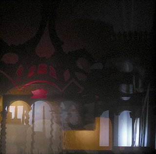
Lovely and haunting, these works exploit associations with forms ancient and recent by which we entertain fantasies and memories, hopes and fears--all forms of projection, puppet theater, the shadows on the window shade at night, as well as painting, particularly Asian landscapes and Baroque and Romantic scenes. Part of a larger project the artist refers to as "Memory Palace," the pieces evoke the centuries-old mnemonic device from which her investigations take their name (as you move mentally through a chosen architecture, each room triggers the information you've assigned to it). But one need nor be familiar with the ancient method of committing speeches or literature to memory to find oneself moving through those land/ cityscapes trying to unlock meanings and memories and constantly gauging their tone and implications. Elegant as they are, the Terrace 49 pieces leave one unsure whether their scenes are calm or catastrophic: They're as close to one's recall of an amazing sunset or breaking storm as to one's memories of a fire, a World War II bombing blitz caught on film, or live night vision over Baghdad.

The architectural constructions mobilize the familiar and iconic images of the cityscape to investigate physicality, space, memory, and artifice. Her room size installations evoke the impression of what she calls “futuristic ruins” a vision of the urban, post industrial landscape synergizing the classical past and the Hollywood fantasies of the future. It creates an unsettling indeterminacy as to the actuality of the familiar urban vistas presented. Lim often utilizes mythic or historic contexts to provide an ironic counterpoint to the present-day targets of her work.

That dissonance is further explored in Lim’s recent project memory Palace, 2003. The panoramas are oddly familiar yet impossible to place in either space or time. The architectural shorthand is deliberately vague, such that the viewer is left unsure to what exactly is being depicted, whether future or past, wasteland or utopia. The title of the series nods to the medieval mnemonic device of mentally constructing an architectural interior which can be filled with imagined objects as an aid to memory-fitting, given that in Lim’ imaginary spaces, the projection onto the work of the viewer’s memories and preconceptions is as vital as the projection of the light coming off of it.

Marcel Duchamp: spatial illusions

http://www.infoplease.com/ce6/ent/A0857656.html

Cubism consructed new ways of seeing through spatial illusion. The cubists employed an analytic system in which the three-dimensional subject (usually still life) was fragmented and redefined within a shallow plane or within several interlocking and often transparent planes. The cubists sought to show everyday objects as the mind, not the eye, perceives them—from all sides at once. The geometric forms and compressed picture space in his paintings appealed especially to Braque, who developed them in his own works.

Duchamp's Nude Descending a Staircase was among the earliest attempts to depict motion using the medium of paint. Its conception owed something to the newborn cinema, and to photographic studies of the living body in motion, like those of Marey and Muybridge.

It was also an antidote to Cubism’s greatest weakness: Cubist paintings were invariably static. Instead of portraying his subject from multiple views at one moment, as Cubist theory would dictate, Duchamp portrayed her from one view at multiple moments, as Muybridge did. By turning Cubist theory upside-down, Duchamp was able to give his painting something the Cubists could not: vitality.

Duchamp said the swift nudes were “flights of imagination” introduced to satisfy his preoccupation with movement. They can also be seen as flights of imagination on the part of the king and queen — which makes this painting, like The Chess Players of 1911, about portraying thought. There is a greater degree of depth than in the preceding paintings, but margins between foreground and background are indistinct. As the eye moves around the canvas, its forms fluctuate in and out, change contours, and shift positions. This is a picture of complicated flux.

Robert Delaunay: orphism

http://www.guggenheimcollection.org/site/movement_works_Orphism_0.html

Excerpted from the Guggenheim Collection
In 1912 the poet Guillaume Apollinaire applied the French term Orphisme to the visionary and lyrical paintings of Robert Delaunay, relating them to Orpheus, a poet and musician in Greek mythology. It also applies to the paintings of Sonia Terk Delaunay and is often mentioned in connection with Frantisek Kupka and a group of then-contemporary American and Canadian artists, called Synchromists, who painted according to a system of “color harmonies” that equated hues to musical pitches. The term Orphic Cubism is sometimes used instead of Orphism because of Robert Delaunay’s roots in a Cubist style. Departing from the limited palette of Georges Braque’s and Pablo Picasso’s initial phase of Cubism, the Delaunays’ paintings are full of brightly colored circular forms, the color combinations of which are based on the “law of simultaneous contrast of colors,” developed in the 19th century by French chemist Michel-Eugène Chevreul.

The advent of this style marked a rupture with the European traditions, traceable to the Renaissance, of pictorial illusionism and the organization of compositional space in terms of linear perspective. Its initial phase (ca. 1908–12), known as Analytic Cubism (referring to the “analysis” or “breaking down” of form and space), developed under the influence of Paul Cézanne’s and Georges Seurat’s formal innovations. The Cubists fragmented objects and pictorial space into semitransparent, overlapping, faceted planes of pigment, thought by some to show the spatial shift from different perspectives within the same time and space and to emphasize the canvas’s real two-dimensional flatness instead of conveying the illusory appearance of depth.

With Analytic Cubism, Braque’s and Picasso’s attempts to depict the conceptual planes of figures and objects in space developed into an austere, depersonalized pictorial style. They at first employed a limited palette of ochers, browns, greens, grays, and blacks, which were considered less expressive than a full range of color, and in 1911 began experimenting with simulated textures, shadows, and modern stenciled typography. The elements within Cubist compositions often inverted the devices of artistic illusionism as if mocking the codelike qualities of two-dimensional representation. In 1912, as part of their exploration of the ambiguities of real and representational space, they adopted the technique of papier collé (from the French coller, meaning to paste or glue), wherein overlapping and fragmented pieces of newspaper, wallpaper, tickets, cigarette packages, and other detritus were arranged, altered, and adhered to the ground of paper or canvas, disrupting Modernism’s inviolate picture plane. By 1913 Analytic Cubism was succeeded by Synthetic Cubism, in which the “analysis” of objects was abandoned and replaced by “constructing” or “synthesizing” them through the overlapping of larger, more discrete forms that seemed as if they might have been cut and pasted to the canvas. This new form of Cubism, which featured brighter colors, ornamental patterns, undulating lines, and rounded as well as jagged shapes, was common into the 1930s.

Robert Delaunay chose the view into the ambulatory of the Parisian Gothic church Saint-Séverin as the subject of his first series of paintings, in which he charted the modulations of light streaming through the stained-glass windows and the resulting perceptual distortion of the architecture. The subdued palette and the patches of color that fracture the smooth surface of the floor point to the influence of Paul Cézanne as well as to the stylistic elements of Georges Braque’s early Cubist landscapes. Delaunay said that the Saint-Séverin theme in his work marked “a period of transition from Cézanne to Cubism.”

Delaunay explored the developments of Cubist fragmentation more explicitly in his series of paintings of the Eiffel Tower. In these canvases, characteristic of his self-designated “destructive” phase, the artist presented the tower and surrounding buildings from various perspectives. Delaunay chose a subject that allowed him to indulge his preference for a sense of vast space, atmosphere, and light, while evoking a sign of modernity and progress. Like the soaring vaults of Gothic cathedrals, the Eiffel Tower is a uniquely French symbol of invention and aspiration. Many of Delaunay’s images of this structure and the surrounding city are views from a window framed by curtains. In Eiffel Tower (painted in 1911, although it bears the date 1910) the buildings bracketing the tower curve like drapery.

The artist’s attraction to windows and window views, linked to the Symbolists’ use of glass panes as metaphors for the transition from internal to external states, culminated in his Simultaneous Windows series. Delaunay stated that these works began his “constructive” phase, in which he juxtaposed and overlaid translucent contrasting complementary colors to create a synthetic, harmonic composition.

Guillaume Apollinaire wrote a poem about these paintings and coined the word Orphism to describe Delaunay’s endeavor, which he believed was as independent of descriptive reality as was music (the name derives from Orpheus, the mythological lyre player).

Wednesday, March 01, 2006

relative parallax

relativity
The distance between two objects appears different from different Cartesian directions, but remains constant. The path taken by a thing in both space and time is known as the space-time interval. Space-time intervals are difficult to imagine; they extend between one place and time and another place and time, so the velocity of the thing that travels along the interval is already determined for a given observer.

The last consequence is that clocks will appear to be out of phase with each other along the length of a moving object. This means that if one observer sets up a line of clocks that are all synchronised so they all read the same time, then another observer who is moving along the line at high speed will see the clocks all reading different times. This means that observers who are moving relative to each other see different events as simultaneous. This effect is known as “Relativistic Phase” or the “Relativity of Simultaneity.”

Special relativity inter-relates space and time in such a way that the speed of light is constant, and the theory leads to situations where two observers can disagree over time intervals and distances between events, but without ever disagreeing about what events actually happened. It shows that time can pass more slowly if an observer is moving, depending on their relative speed.

parallax
Parallax (Greek: (parallagé) = alteration) is the change of angular position of two stationary points relative to each other as seen by an observer, due to the motion of an observer. Simply put, it is the apparent shift of an object against a background due to a change in observer position.

In a philosophic/geometric sense: An apparent change in the direction of an object, caused by a change in observational position that provides a new line of sight. The apparent displacement, or difference of position, of an object, as seen from two different stations, or points of view. In contemporary writing a parallax can also be the same story, or a similar story from approximately the same time line, from one book told from a different perspective in another book

Parallax is often thought of as the “apparent motion” of an object against a distant background because of a perspective shift. Binocular parallax is a binocular clue to depth perception, especially of near objects. Each eye views an object from a slightly different position, so the image seen by each is slightly different; fusion of the two images in the brain creates perception of depth. Monocular parallax is an important monocular clue to depth perception. As the head or the eye is moved from side to side, distant objects appear to move more slowly than do closer objects.

E.V. Walter: placeways

The things of the world cannot be known, except through a knowledge of the places in which they are contained. ROGER BACON

Placeways is a philosophical and historical interpretation of the experience and meaning of place. The book develops a theory of topistics, a holistic way of grasping a place as the location of shapes, powers, feelings, and meanings. The author examines the changing realities of expressive space, and reveals the nonrational, symbolic, and intuitive features in our experience of places. The current crisis of environmental degradation, according to Walter, is also a crisis of places. True renewal will require a change in the way we structure experience and return to an ancient paradigm for understanding the natural and constructed world. Topistics is the study of Placeways. The book explores energies of places and the modes of
experiencing them.


In popular writing about architecture and geography, “sense of place” has degenerated into a cliche, often suggesting little more than superficial impressions. Nevertheless, a place with integrity does make sense—it conveys meaning. The real “sense” of place, therefore is twofold. On one hand, people feel it. On the other hand, they grasp its meaning. Today, the experience of place is often out of balance. Preoccupations with the logic of space tend to suppress the feeling of place. There is a tendency in modern thinking to separate the feelings, symbolic meaning, moral sentiments, and intuitions of a place from the intellectual, rational features. Places, therefore, tend to lose an old kind of meaning: expressive intelligibility.

The integrity of a place suffers when we learn by ear gets disconnected from what we perceive with the eye. The imagination makes sense. We get to know a place when we participate in the local imagination. The whole synthesis of located experience— including what we imagine, as well as the sights, stories, feelings, and concepts—gives us a sense of place. For the first time in human history, people are systematically building meaningless places. As we contemplate the ruins and dislocations of our cities, another way of understanding the built environment and the natural landscape is struggling to emerge.

We recognize different kinds of place change. The same place does not remain the same. No city is what it used to be. Yet, despite great changes, some places continue to make sense.

Ancient thinking about place, theoria, grasped the whole experience of a place. It meant seeing the sights, seeing for yourself and getting a world view. It involved senses and feelings. As a theorist Herodotus gathered different kinds of information about places. Putting together what he saw with his own eyes, what he heard, what was “known” as well as recording the memory and the “words” of the place. Local guides helped the visitors “see” Almost every town had periegetes, expert local guides who showed people around, pointed out notable sights, described the local rituals, explained the customs, and told traditional stories of historical and mythical events. They were living archives of placeways. A periegete was a tour guide who led people around, giving commentaries on whatever was worth seeing. The best guides represented the whole integrity of places. They would describe a place not “objectively” but holistically, in a pattern that included the elements that Plato identified as shapes, powers, and feelings.

A place has no feelings apart from human experience there. But, a place is a location of an experience. It evokes and organizes memories, images, feelings, sentiments, meanings, and the work of the imagination. The feelings of a place are indeed mental projections of the individuals. But, they belong to the place.

The full range of meaning located as “place”—sensory perceptions, moral judgments, passions, feelings, ideas, and orientations-belong to an order of intelligibility that I call “topistic reality.” A place is a matrix of energies, generating representations and causing changes in awareness. To recover archaic theoria means to experience a place through a whole—combining feeling, imagination, and memory, together with the intellect and the senses.

William Latheby called architecture building touched with emotion. Pathetecture means constructing emotion by building. It is the process of making expressive space by material means—locating experience by distributing objects and representations. The process works through organizing or disorganizing materials through construction, dilapidation, and excavation.